|
This blog and portfolio was first assigned in Q1 of freshmen year of the GAD course, where we put images of primitive adobe pizza and 3D pencil models the crazy lady "taught" us how to make. My first blog post was made with the title box and was about how I threw up on a camping trip, and I never thought it would be graded throughout high school in our course, let alone actually have it actually be a part of myself open on the internet for people to see, or at least I think they see. Freshmen Year It's really weird to remember that first cover image I had for the site. Unfortunately I didn't keep the image of my "self portrait" and it's now lost to time, probably for the better. This was around when we were learning about Adobe and 3DS Max, which are legit really useful since pretty much any editing software is similar to that line. This was also the time I made pixel art, really really subpar pixel art, masked by the fact it was super deformed. Guess it followed me to now, people still call it chibi. 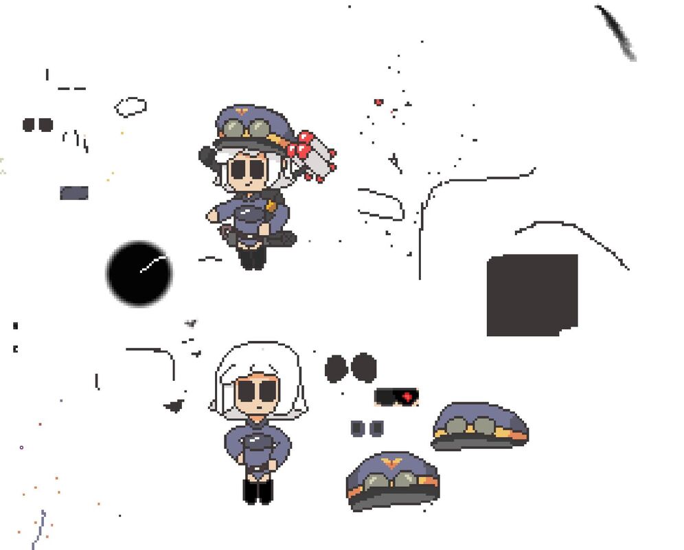 Wow, this is messier than I remember. Probably because I got my layers mixed up a lot, the colors were over three random layers. Sophomore Year This is where things really took off, unfortunately this was all 3D work, which was pretty boring since it's all technical and was a slog with how many tutorials we had. But, this was the opportunity to really express myself with what I consider to be an awakening of my capabilities. Because of a certain little android. Also I did actual drawing, with the occasional batch of pixel art which I strayed a bit away from. This really was the time when I took pride in selected works, since you get to put in 3D models from class as freebies for the selected works requirement.
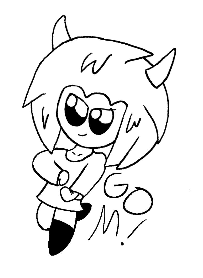
Junior Year Now this is what I remember fondly, not only was it when we were let of school for quarantine, but it was also the time I took more time to really flesh out my creations, I even put SHO and the Machine Girl concept in a GDD, well sorta since I didn't have enough time (or effort) to finish and still got an 80% for it. I legit found my own style this year oddly enough, things really do work out like that huh? 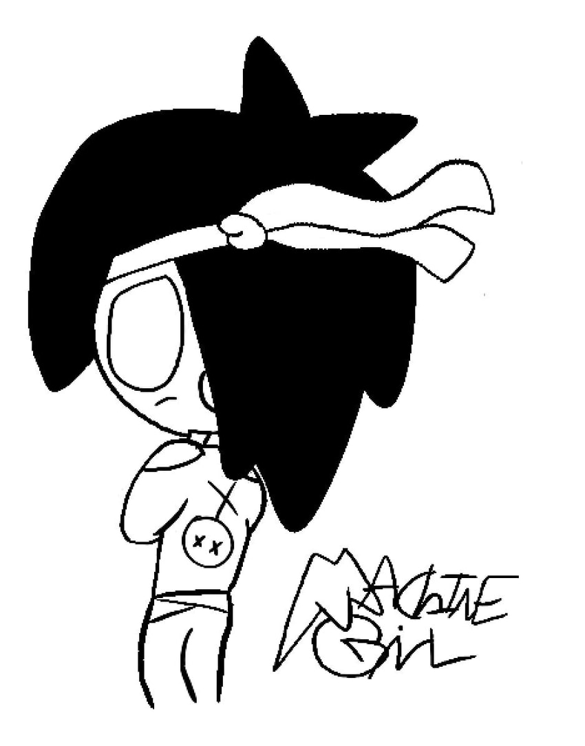 This image actually came from Sophomore year, but I still think it deserves to be here because I drew it to be a game cover. Senior Year This year was... interesting to say the least. In the very last quarter up to testing, I did not feel like working in school anymore until university. But that's a part of growing up, knowing when to stop caring too much. This year is personally just one to reflect on everything up to this point, how I really did grow as an artist and even learned a lot about digital everything.  Personally it's not that good, the lines are scraggly and the proportions are weird once you look closely. But it has improved since I could do so much more in senior year. Overall, I am very thankful I took a CTE course. This doesn't even bring up the unexpected parts of the GAD course, like how we had senior friends due to the classes, the unexpected software not working so we got off free, and of course the fact we could be exempt since it's still in pilot status a lot. There was also lots of funny stuff that went down, from the photoshop edits, to the dumb jokes, and even how we screwed with the computers (the overstuffed desktop comes to mind). I am very thankful to be a part of the school that was as strange as could be. 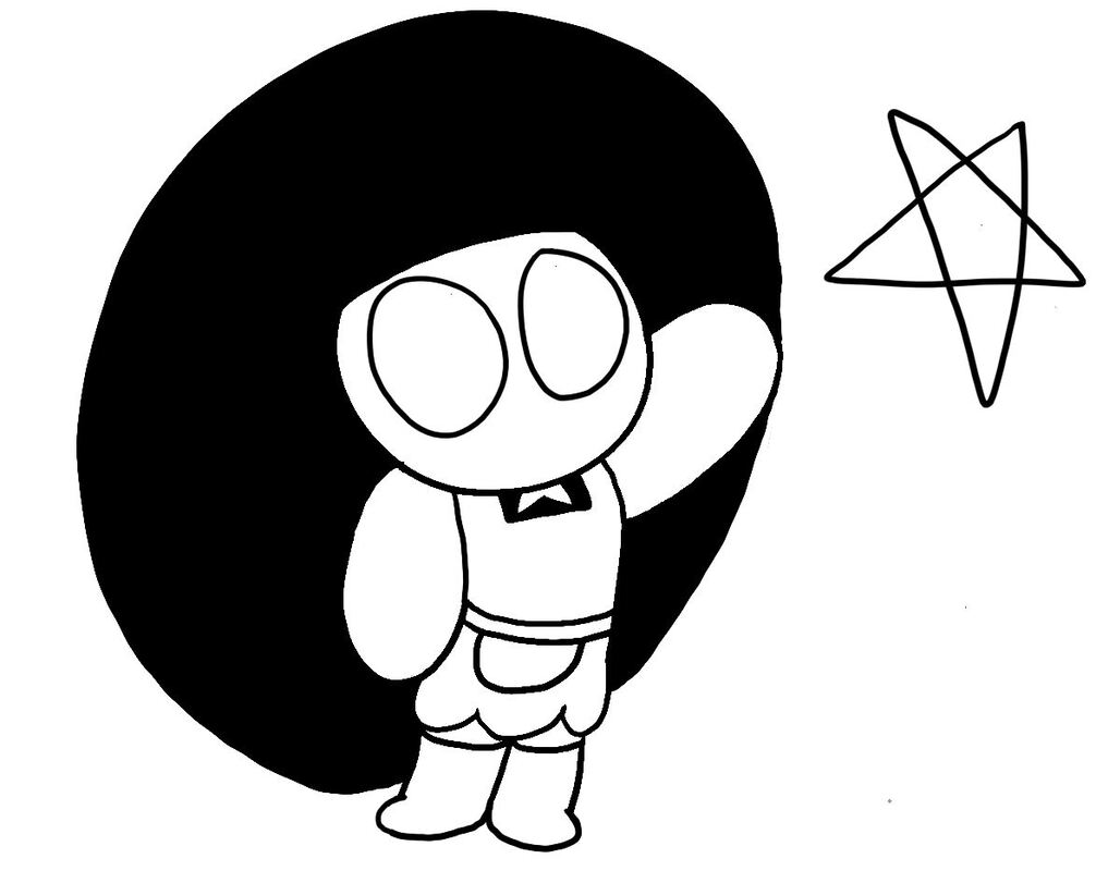 Here is To Doing More Stuff and Things!
0 Comments
Sketching and planning are very important skills that were learning after a while. This is so because Whenever I draw something, I usually just draw a circle, hair, then draw some bean shapes then put some details on it. Nowadays, I have to sketch a light circle, some lines to direct where it will look, then plan out the body's shape and position before any real work, then I hard line every aspect of it. This takes a lot more work and time (ewww work) but it does make much more good looking people, along with carrying the small characters within it. I always used to draw tiny chibi characters because I was too hard headed to really get into formal drawing, now that I can do both, it allows so much different characteristics that are much less limited than stubby leotard girls. Sketching as helps, as laying down everything in a general aspect before any solid lines makes it much easier to visualize as you go, and less of a pain when changing one part on the whole image. But, they do then to look like really stylized characters, so that's a step in the interesting direction I'm basically just doing what I was taught how to do it throughout high school, sounds a bit like a self problem but it still relates to what I've worked on over the last month. Cheers to that. If you don't plan out what you're drawing, you'll get lost in what idea you were drawing
 Character Sketch Staff, Creative Bloq. “20 Sketching Tips to Help You Make Your Mark.” Creative Bloq, Creative Bloq, 24 June 2020, www.creativebloq.com/illustration/sketching-tips-beginners-81516497.
“5 Essential Sketching Tips for Beginner Artists.” Erika Lancaster-Artist, Content Creator & Online Art Tutor, www.erikalancaster.com/art-blog/5-essential-sketching-tips-for-beginner-artists. How would you make a piece of art more interesting that the art's own content? One way is play around with the way the image is presented, which can be done in many different ways. This frame could represent an object, a lot like an actual frame for a fancy painting, only in a regular image, since it tells an image's story in a new light, and gives a bit more flare to the subject. A nice example is the recent Polaroid image recently made, the "frame" is in a single photograph, but it narrows down possibilities of many important details. Since it's a photograph, it shows a demographic of who took it, the circumstances/ story behind it, and a specific time frame. To put it simply, it shows a classic late 20th century summer break story, all in one small frame change. The tilt and handwriting (yes, I did that on purpose) also gives a personal touch to the image. What also helps with the composition, how close certain subjects are, how much they are compared to the background, and many other principles I have made a power-point about. Regular pictures taken are usually not taken with every single composition being as well thought out as possible, which gives then their own charm, and makes the easily recognized photo drive the point home. The fact both subjects are cut off slightly, and are abnormally distant show that it was a made-on-the-spot image, making it much more natural. So, what new subject have we learned?
Sources Laura Morelli. “The History of Picture Frames.” Laura Morelli: Art History, Art Historical Fiction, Authentic Travel, Laura Morelli, 31 Jan. 2019, lauramorelli.com/history-of-picture-frames/. (A short article detailing frames' and paintings' importance of each other, along with the frame's own importance by itself) 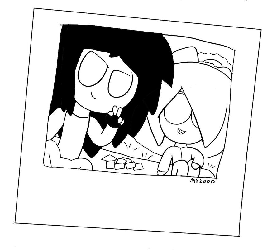 The photograph shows specific details by only existing, like time period and what type of people are in the image
The first topic, what summer blog posts focus on, is to talk about that's new is how to diversify characters. A very important fundamental of visually and physically making a character actually express traits, instead of outright saying any sort of characteristic. There are many, many different ways to translate traits and intentions. But it all starts from an identification of self. Literally, who they are and what they are telling. Explaining this starts with telling either a good or bad inclination, which can be much more than either "I'm Approachable" or "Don't Come Near Me." Then making something out of simple shapes, which is to not only help me mentally organize what they are meant to be, but also make an instant recognition for whoever sees it. This is seen more clearly with a character being either rounded or sharp, particularly in hair, but there are many subtle ways to do this. Seen in mouth and eye markings. Next is to put it all together, it's good to have one or two defining characteristics, but more would devalue each "piece" and make it a kinda mess, it's not horrible but it's a bit much. Clothes are another big part if you plan on actually finishing a sketch, unless you feel lazy and only do the face. Whatever is being worn is what puts the influence on a character, can is the more fun parts of making a character, trying to make outfits, especially adding depth to a character with multiple outfits. Colors also matter, but I was never good with quickly making deep color choices or making good gradients, so I rarely consider them. But it's never a bad thing to consider if you know what you are doing. What did we learn from this summer blog post?
Sources Justine Musk. “13 Ways to Create Compelling Characters.” Justine Musk, 29 May 2013, justinemusk.com/2010/02/01/13-ways-to-create-compelling-characters/. Langley, Rebecca, et al. “How To Make Sure Your Characters Don't Speak In The Same Voice.” Standout Books, 11 Apr. 2018, www.standoutbooks.com/character-voice-different/.
Last Year, I mainly focused on pixel art images, which I thought are pretty cool, since it was one of the first pieces of real art I felt like showing off. But, towards the beginning of this year, I was more inclined to making different pieces of art, since it's mainly based off other characters. Making stubby-ish characters are what inspired current characters. This was one of the first real changes to the art style I had, since the ink pen tool made it possible. Now, that I can draw clear concise lines, it mean a major adjustment. Making a body was much more specific, but less time consuming when a single pixel or two made an arm look weird. But, the major change after this was making less smol, stubby characters. People had longer limbs, and less body mass. This is what eventually lead to the current type of drawing, which even comes with learning to draw hands and stuff. Which are just as hard to draw as the entire body, in my opinion. But, making each piece was faster, to an extant, and I can make them all at once, or pick back up after a while. But, in the end, it means i'm growing as an art person.
Stubs Compared To Arms
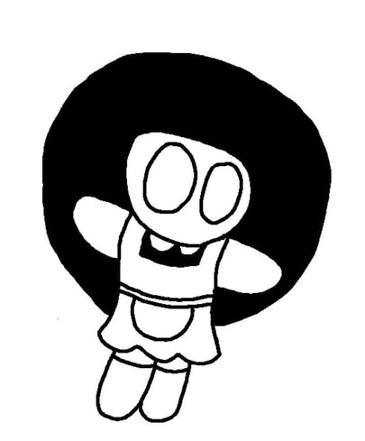
This past quarter, you may have noticed the newer artwork is based on a concept started all the way back in September. MG stands for Machine Girl, by the way, the number makes it seem more tech-y. So, the best time to explain exactly WHAT it's art of now, since I never do so when I first made artwork. Machine Girl was inspired one of those crazy Band Camp groups with the same name, with music influenced by Jungle, Break-core, and other musical sub-genres, which leads to MG. The first two characters, currently unnamed, are dressed as maids, ever since I got this maid table top game, while others are dressed much more casual. Some characters have stubs, and blank eyes since they are androids, which were inspired by kitchen appliances, influenced by their maid nature, and were influenced by the group's own name, Machine Girl. Which, looking back was weird to use the same name, but it stuck and I don't know what to do about it, it defines what MG is about so well. There's no real story, per say, but for a small group of artwork, i think it's enough. But, a taller individual, who is also unnamed, sports spikier hair and gloves, which I thought looked cool, so "let's just draw that on a character," which I like to think of much more untamed but similar to the usual two. Just a way to branch out, which I do plain on doing in the future, hopefully with someone to really invest this with. This was just something that I wanted to make, and actually enjoyed the end product, so I just wanted to cement the concept SOMEWHERE. You can see the artwork and the gradually changing style in "Selected Works." But, I do hope to see this in the future, someday... 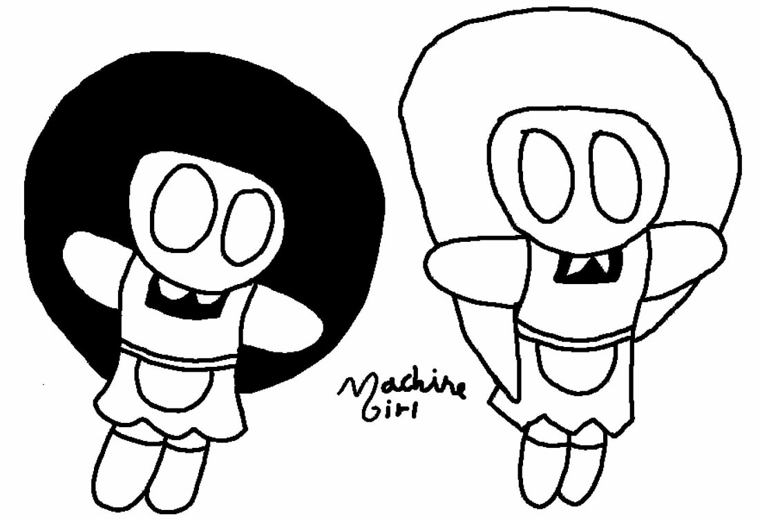 Looking back at this early-made shot, it was very rough, but making the fancy logo was pretty fun
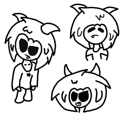
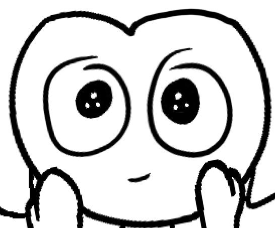
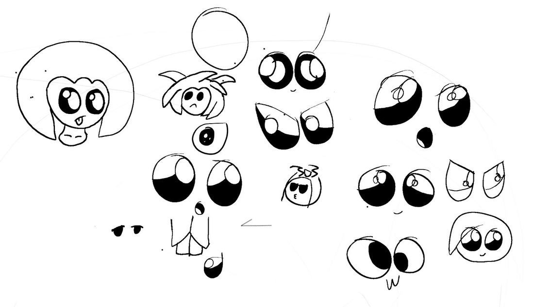
I guess that's what I'm calling them now, since it's easier when I want to just make one. But, recently I've thought of moving away from the pitch dark eyes of the previous works. I decided to change this because, I felt that I didn't have enough characteristic in any characters. It was there to an extent, but doesn't fully show it. Also, it's hard to tell where they're looking, especially if it's the opposite direction of their heads, oof. So, making real eyes, with pupils and light, is not that hard. The thing is, it's really a bunch of circles, but very meticulously put together circles, which can change a lot about eyes. You can put a lot of detail into eyes, without even changing color or shape that often, how solid they look can change how "living" a person looks. While the area of shade is going to change their outlooks. But, sometimes, I still miss the solid, black eyes, it reminds me of a simpler time, euugh.
 a small piece of the experimentation process
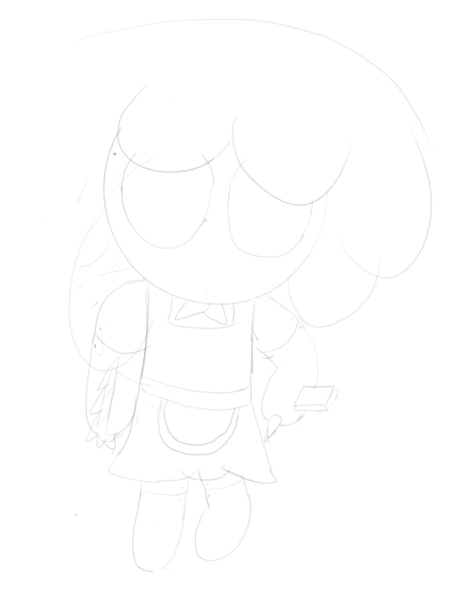
This week, we started on more stuff in 3DS Max, but what also happened this week was a FAILING GRADE for my MoQ Check. This made my heart sink, and my mind throw up, and vice versa. But, later I saw that this was from one small segment of the rubric. This was the portfolio page, which was updated, but didn't have my class projects, since I put my one piece in class on another section. I guess this was my fault, my portfolio is a bit weird. But, the only thing I can really take away from this is, better organize your work, and think of who's viewing. So, this means, I still have a lot of work ahead of me, including current projects in school, oof. 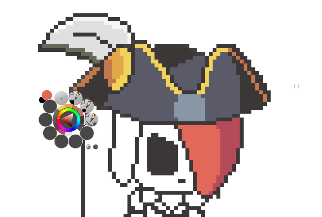 The work in progress for the previous work posted, Scarlet
Well, when I first forced myself to draw stuff, I simply saw what something looked like, and drew it. That's the main reason why I started out pixel drawing Crusader Quest stuff, it's a basis for me to draw. Also, I liked Crusader Quest, check it out. But, what I learned from that is that hair is not two dimensional, having layers, and loose ends. This really changed my perspective when I figured it out. When I first made hair, it's a straight line around a head, with some hairline changes. Now, this weekend, I'm applying this to more hair, and stuff. I also applied having structured shoulders, wow. Although, I do struggle with necks, and waists. These little changes are small, rather redundantly. But, these are smaller steps into what I think is a unique style that will form, I hope. This blog is for documenting that gradual change, after all.  Ideal GF
Uh oh. It's the special End Of Quarter posts part 2. So, I actually SHOWED my art that I make to another person, Mavis, and she thought it was good. But, I finally did this because other people's art stuff was on the board, I've heard of the board, it's a bit of an accomplishment. So, my art wasn't featured because I didn't really submit anything for the computer contest thing. I didn't submit because I didn't think we would do this much with it. So, in order to really expose myself and stuff, I'm talking about my stuff. So, my stuff, at home that is, not the school stuff, is a bit easy to make, in my opinion. Since, it's not a multiple draft, figure drawing, sort of art. The lines made are easy to edit until they are, since it's bit based and not messy if you continually try to draw a new line. This is why I mostly favor bit art, it's easier to edit, layer, and organize, also, Crusader Quest, the game most of them are based on, also features 16-bit sprites, so it just makes sense. But, I actually did draw in a certain sketch book for a while. I didn't have THAT much drawing education. So, I think they are good for a person that probably should. So, I think I'm a good art person, and I should probably show that more often. 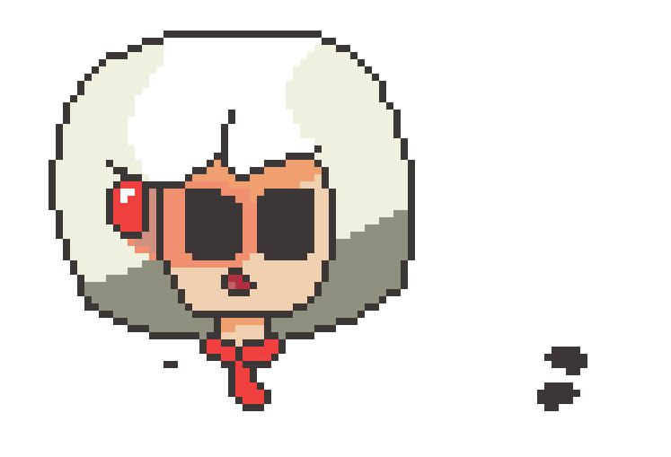 Image in Krita I'm working on.  One of the original drawn images
|
JamesHe aspires to be a game designer, let's just hope he gets there. He also happens to goes to DSA. Categories
All
Archives
August 2021
|