|
Wow, a non-school post that isn't the week before the EoQ check, this is insane. So, I take Media & Design II, and we recently turned in our pictures we had to take, and I liked them so much, that I decided to make a blog post about them. I don't know if they count as digital media, but I already have a couple of assignments to upload to the selected works tab. 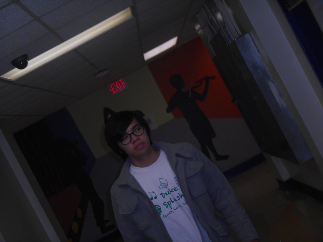 So, in this shot I try to go for a 'lost and unsure" sort of feeling, as evident by darkness, confused face, and dutch angle(ayy). 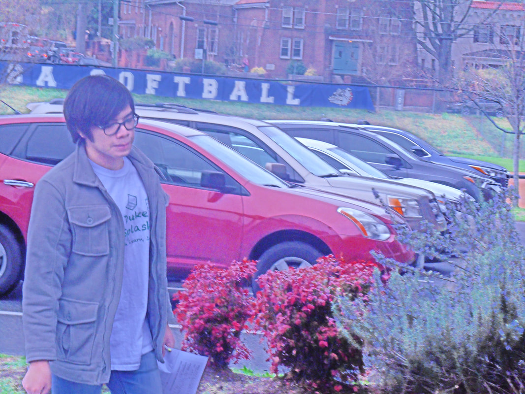 This shot shows a sort of "not feeling it" face in a bright, but not exactly happy, light. This shot reminds me of the, I can't believe I'm going to say this, "say boy aesthetic" because of the contrast. Although, I didn't plan for it to look like this, but may as well go with it. 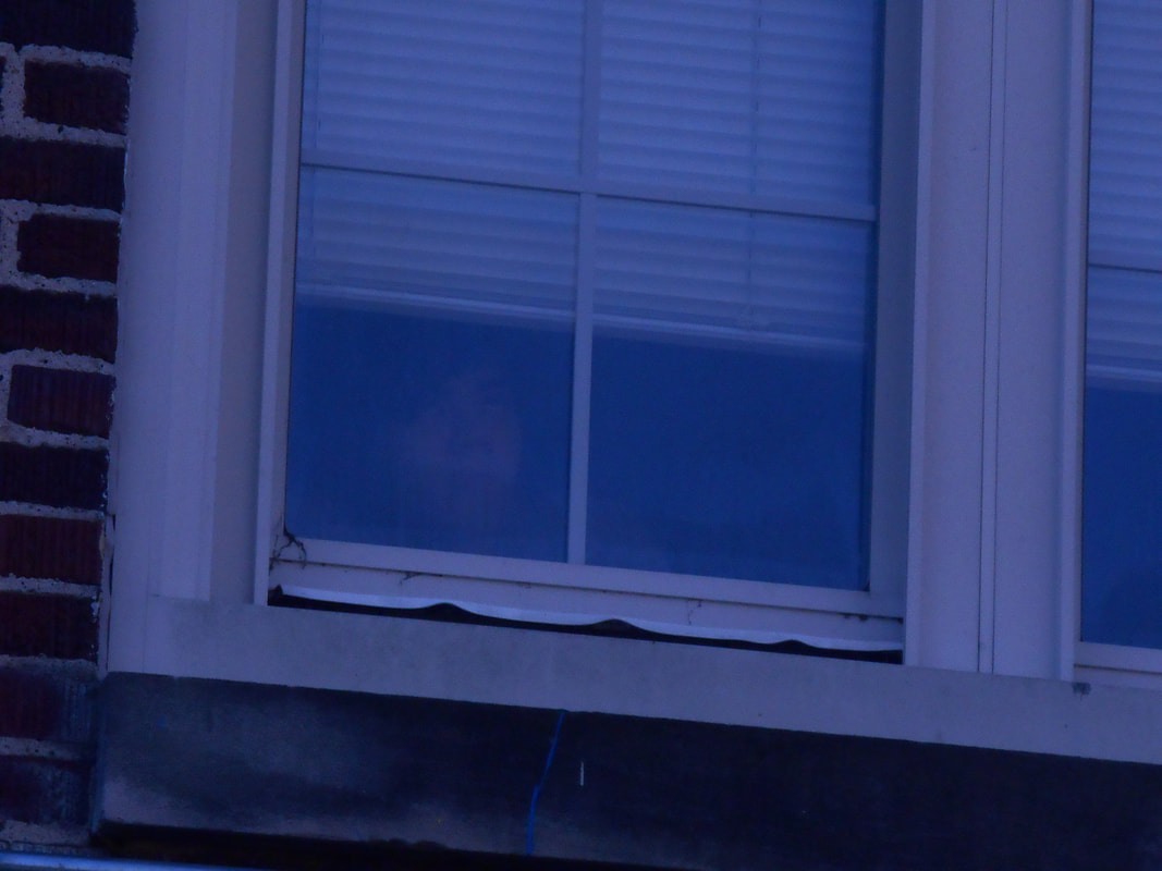 This one may be hard to see, but if you turn up your brightness, you could see a face, which is my face. It's a funny story how this was made, I asked my friend, Jack, to take a picture of me looking through a window to go for a nice shot of me thinking. But, because the old school windows were so foggy, it the filter Jack put on, and the fact he took so long, that I was rolling my eyes in the shot, it turned into a ghost photo. So, I made a new role, the odd, "insider looking out" sort of person, even though, that label is a little embarrassing.
So, hopefully I get a sort of good grade for this, I only have an eighty seven in M&DII right now.
0 Comments
So, we are now learning about the use of color in visual art. But, nobody really "invented" the concept of seeing color as symbolism, well, maybe, but not overall. So, I'm going to research what the absence of color could symbolize.
People know that black, white, and sometimes gray aren't always on the color wheel. They might be on the very edge of a hue of a color, but this is really it. This is because they are special colors that are almost different by themselves, this makes it so any base color could show up in black or white. So, how does this show up in it's more symbolic view? Most people think of black and white as good and evil, or as something and the absence of such. But, as a design element, it is used to represent good and bad. This is self-explanatory, dress the bad guy black and the good guy white. But, that is one of the superficial representations. If you use black and white in, say, in a drawing or animation, it gives a feeling of simplicity or "amateurish" quality. It could also be a cop out for colors, but simplicity is a composition rule, so, if used correctly, it works. Black and white is also very vintage, most old photos and movies were in black and white, so it evokes an old sense. This is why most people still make black and white photos, to evoke a sense of timeless classic-ness. Black and white also has a use with other colors, this could be good and bad morality. But, the more creative use is to emphasize one color, like a black and white film having a little bit of red, mainly for blood, lipstick, or balloons. This makes it much more standout, which has more symbolism, like violence, romance, or simple interactions. What did we learn from this?
https://www.fatrabbitcreative.com/blog/psychology-of-black-and-white-and-what-they-mean-for-your-business https://digital-photography-school.com/why-black-and-white-photography/ ... actually, it was just work about composition, including this website. So, in order to make up for the last blog post, i'm going to ACTUALLY listen and research some concept about composition. Now, I look up who invented "the rules of composition" and click the first article site that mentions such.
The Rule of Odds was invented by John Thomas Smith(1766-1833), as he explains how a good picture should align with lines in an intersecting way, in the book "Remarks on Rural Scenes." he also goes to say that pictures that has an un-even or contradicting way is not the most interesting thing to look at. So, he made the rule, and it made sense, now most image makers use this for good composition. So? what did I learn from this?
https://www.bhphotovideo.com/explora/photography/tips-and-solutions/who-wrote-rule-thirds%3F So, we learned about Principles and Elements of design. When I was listening to all of this, I thought of how this actually affects art, and I just realized that it ACTUALLY matters. The accompanying project was also with this topic. When I heard everybody was like "Oh, this project was ridiculous, I mean this AND the orcs submission AND the EOQ blog posts." But really making each slide just made sense: explain what it is, make a picture that relates to the topic, and be creative with it. I didn't even have to cite any information, which is, personally, my least favorite part of any project, since we used class materials. So, I actually like doing each presentation, AND I get good grades on it, it's practically one of the reasons I'm still in this class. The material itself really is just easy, if you think about it, I liked making funny little edits with each slide, like making balance's text centered, or having contrast have a black background and white text. So, the next week we had a lesson on composition, which made EVEN MORE sense. The best part of this wasn't looking up game screenshots that used this technique , because it was scary being around people that could judge you based on your examples, but because I SAW these techniques in my personal art when I'm bored in school. It's actually scarier to see this in art that in little doodles that aren't meant to have proper formatting. So, what DID I learn these weeks?
 When I was listening to the lecture, I realized I saw this before, and drew in little lines and arrows pointing at the center points (ignore everything else, I am in high school) 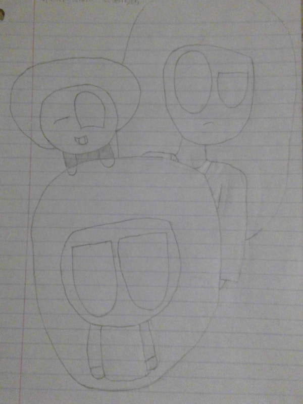 Rule of Thirds, Rule of threes, and simplification (I guess)
|
JamesHe aspires to be a game designer, let's just hope he gets there. He also happens to goes to DSA. Categories
All
Archives
August 2021

|
