|
How would you make a piece of art more interesting that the art's own content? One way is play around with the way the image is presented, which can be done in many different ways. This frame could represent an object, a lot like an actual frame for a fancy painting, only in a regular image, since it tells an image's story in a new light, and gives a bit more flare to the subject. A nice example is the recent Polaroid image recently made, the "frame" is in a single photograph, but it narrows down possibilities of many important details. Since it's a photograph, it shows a demographic of who took it, the circumstances/ story behind it, and a specific time frame. To put it simply, it shows a classic late 20th century summer break story, all in one small frame change. The tilt and handwriting (yes, I did that on purpose) also gives a personal touch to the image. What also helps with the composition, how close certain subjects are, how much they are compared to the background, and many other principles I have made a power-point about. Regular pictures taken are usually not taken with every single composition being as well thought out as possible, which gives then their own charm, and makes the easily recognized photo drive the point home. The fact both subjects are cut off slightly, and are abnormally distant show that it was a made-on-the-spot image, making it much more natural. So, what new subject have we learned?
Sources Laura Morelli. “The History of Picture Frames.” Laura Morelli: Art History, Art Historical Fiction, Authentic Travel, Laura Morelli, 31 Jan. 2019, lauramorelli.com/history-of-picture-frames/. (A short article detailing frames' and paintings' importance of each other, along with the frame's own importance by itself) 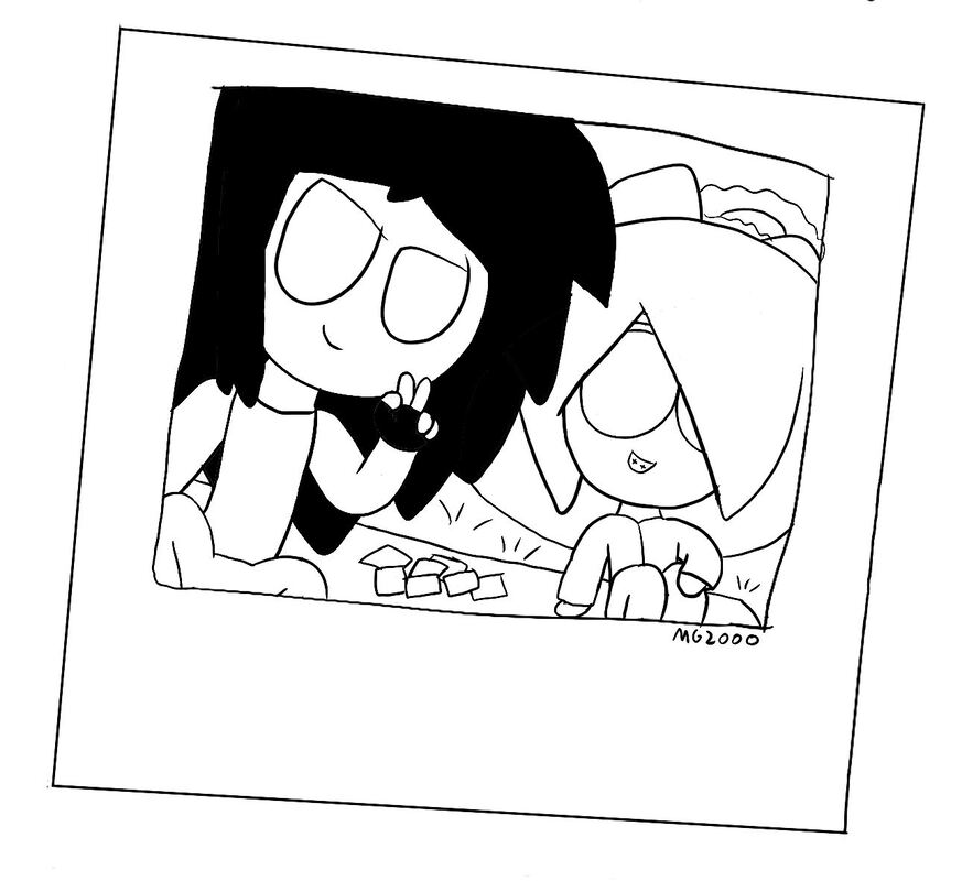 The photograph shows specific details by only existing, like time period and what type of people are in the image
0 Comments
The first topic, what summer blog posts focus on, is to talk about that's new is how to diversify characters. A very important fundamental of visually and physically making a character actually express traits, instead of outright saying any sort of characteristic. There are many, many different ways to translate traits and intentions. But it all starts from an identification of self. Literally, who they are and what they are telling. Explaining this starts with telling either a good or bad inclination, which can be much more than either "I'm Approachable" or "Don't Come Near Me." Then making something out of simple shapes, which is to not only help me mentally organize what they are meant to be, but also make an instant recognition for whoever sees it. This is seen more clearly with a character being either rounded or sharp, particularly in hair, but there are many subtle ways to do this. Seen in mouth and eye markings. Next is to put it all together, it's good to have one or two defining characteristics, but more would devalue each "piece" and make it a kinda mess, it's not horrible but it's a bit much. Clothes are another big part if you plan on actually finishing a sketch, unless you feel lazy and only do the face. Whatever is being worn is what puts the influence on a character, can is the more fun parts of making a character, trying to make outfits, especially adding depth to a character with multiple outfits. Colors also matter, but I was never good with quickly making deep color choices or making good gradients, so I rarely consider them. But it's never a bad thing to consider if you know what you are doing. What did we learn from this summer blog post?
Sources Justine Musk. “13 Ways to Create Compelling Characters.” Justine Musk, 29 May 2013, justinemusk.com/2010/02/01/13-ways-to-create-compelling-characters/. Langley, Rebecca, et al. “How To Make Sure Your Characters Don't Speak In The Same Voice.” Standout Books, 11 Apr. 2018, www.standoutbooks.com/character-voice-different/.
Last Year, I mainly focused on pixel art images, which I thought are pretty cool, since it was one of the first pieces of real art I felt like showing off. But, towards the beginning of this year, I was more inclined to making different pieces of art, since it's mainly based off other characters. Making stubby-ish characters are what inspired current characters. This was one of the first real changes to the art style I had, since the ink pen tool made it possible. Now, that I can draw clear concise lines, it mean a major adjustment. Making a body was much more specific, but less time consuming when a single pixel or two made an arm look weird. But, the major change after this was making less smol, stubby characters. People had longer limbs, and less body mass. This is what eventually lead to the current type of drawing, which even comes with learning to draw hands and stuff. Which are just as hard to draw as the entire body, in my opinion. But, making each piece was faster, to an extant, and I can make them all at once, or pick back up after a while. But, in the end, it means i'm growing as an art person.
Stubs Compared To Arms
This week is the last week of the quarter, and is mainly comprised of more UVW projects, which we have learned to use a bit better, so much so that a new blog post can be made about it. But, many of the techniques used to make a texture is mainly done in textures, made in Photoshop, and how they wrap around the texture to add a new dimension, which is much more easier to due since a map can be made to correctly map certain aspects to the right parts. But, some parts can't be easily mapped, like the sides of textures not picked up on a 2D map. The best thing to do is to peel a texture, which needs a bit more of the texture to fit new sides for textures, which makes more sense if you've seen it. Some textures don't need more of the texture to do so, but there are times to physically make a texture in order to get a convincing texture, Very important in a 3D texture,  This past quarter, you may have noticed the newer artwork is based on a concept started all the way back in September. MG stands for Machine Girl, by the way, the number makes it seem more tech-y. So, the best time to explain exactly WHAT it's art of now, since I never do so when I first made artwork. Machine Girl was inspired one of those crazy Band Camp groups with the same name, with music influenced by Jungle, Break-core, and other musical sub-genres, which leads to MG. The first two characters, currently unnamed, are dressed as maids, ever since I got this maid table top game, while others are dressed much more casual. Some characters have stubs, and blank eyes since they are androids, which were inspired by kitchen appliances, influenced by their maid nature, and were influenced by the group's own name, Machine Girl. Which, looking back was weird to use the same name, but it stuck and I don't know what to do about it, it defines what MG is about so well. There's no real story, per say, but for a small group of artwork, i think it's enough. But, a taller individual, who is also unnamed, sports spikier hair and gloves, which I thought looked cool, so "let's just draw that on a character," which I like to think of much more untamed but similar to the usual two. Just a way to branch out, which I do plain on doing in the future, hopefully with someone to really invest this with. This was just something that I wanted to make, and actually enjoyed the end product, so I just wanted to cement the concept SOMEWHERE. You can see the artwork and the gradually changing style in "Selected Works." But, I do hope to see this in the future, someday... 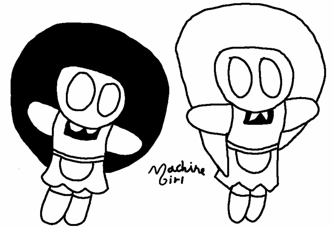 Looking back at this early-made shot, it was very rough, but making the fancy logo was pretty fun
|
JamesHe aspires to be a game designer, let's just hope he gets there. He also happens to goes to DSA. Categories
All
Archives
August 2021
|


